Evolution of Audi's emblem: Journey from script typography to company mergers and circular symbols
The unyielding tale of Audi's logo through the years
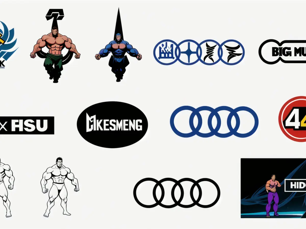
Audi's celebrated four-ring emblem is a testament to the automotive world's enduring iconography. It reflects the brand's legacy and historical background, though it's seen its fair share of controversy in recent time.
From the beginning of the roaring twenties, August Horch, a man with a disputed past at his previous company, established Audi Automobilwerke GmbH, renaming it after the Latin translation of his name, "Listen." Little did he know that his creation would soon collide with three more auto giants, igniting a fusion that would carve the four-ring symbol into automotive folklore.
The merger of titans: In the tumultuous 1930s, rising from the depths of the Great Depression, Audi united forces with DKW, Wanderer, and Horch to form Auto Union. This initial coming together brought forth the symbol that would represent our beloved manufacturer for decades to come - the four interlocking rings.
- DKW, an acronym for Dampf-Kraft-Wagen, was a German car manufacturer well-renowned for its two-stroke engines.
- Wanderer was a motorcycle and automobile manufacturer from Germany.
- Horch, August Horch's original company, founded fame on the back of creating high-quality automobiles.
The four rings signified the unity of these four automotive powerhouses, a union that would prove to be a strength within the industry, as the rings are still an iconic symbol today.
Post-WWII and the modern age
Following the devastation of war, Auto Union faced substantial hurdles, including the confiscation of assets by the Soviet Union. Eventually rebuilt in Ingolstadt, West Germany, the company pressed forward and adapted its logo over the years to reflect the changing times.
The contemporary era saw a shift towards minimalistic and adaptable design that suited the brand's digital transformation. The iconic emblem underwent a makeover, moving towards a more contemporary flat design. Critics have voiced concerns about this change, comparing it to the departure from tradition seen in the 2020 rebrand of another automotive giant - Lamborghini.
In an attempt to become a major player in the Chinese market, Audi showcased a concept car in late 2024 that ditched the rings in favor of a wordmark, sparking controversy and debate among fans. Some anticipate that this bold design statement may lead to a larger transformation for Audi's global identity.
A hidden message
Embedded within the four rings is a tale of the brand's origins and the resilience born from hardship. The story begins in 1932 when Auto Union, struggling financially, introduced the four-ring logo to symbolize the merger of its four companies.
The four rings stand not only as a symbol of unity but also as a testament to the industry's fortitude in the face of adversity. As designers, we can learn valuable lessons from Audi's timeless symbol, knowing that lasting impact and meaningful branding can be achieved by embracing consistency, adaptability, and a clear, powerful message.
- The four-ring emblem, symbolizing Audi's merger with DKW, Wanderer, and Horch in the 1930s, has become an enduring icon in the automotive world.
- DKW, an acronym for Dampf-Kraft-Wagen, was a German car manufacturer known for its two-stroke engines.
- Typography played a crucial role in the logo's transformation during the modern age, moving towards a more contemporary flat design.
- August Horch's original company, Horch, founded fame on the back of creating high-quality automobiles.
- The lukewarm reception towards Audi's minimalistic logo redesign reflects the tension between tradition and innovation in the design world.
- Wanderer was a motorcycle and automobile manufacturer from Germany that eventually merged with Audi.
- UX and UI design principles influenced Audi's digital transformation, resulting in a makeover for its iconic emblem.
- A designer can draw inspiration from Audi's logo, learning the importance of consistency, adaptability, and a powerful message in creating meaningful branding.
- In the roaring twenties, August Horch established Audi Automobilwerke GmbH, renaming it after the Latin translation of his name, "Listen."
- The absence of the four rings in Audi's 2024 concept car for the Chinese market sparked controversy and debate among fans, hinting at a possible shift in the brand's global identity.


